📖 Introduction
An important source of growth for Monzo is word-of-mouth, which is when customers share their experiences of our brand with each other. Our referral scheme encourages this behaviour by rewarding existing customers (referrers) and new customers (referees) with a cash reward once the referee has made their first transaction with Monzo.
When running a referral scheme, we can identify which referees our referrers are inviting to join, but here lies an attribution problem: how do we know whether the new customers from referrals are as a result of the scheme itself (incremental) or would have joined Monzo anyway (organic)? One way to answer this question of incremental growth is to run a regional experiment.
🧪 Why do we need regional testing?
Regional experiments are similar to A/B experiments; however, they use geographies (regions) to define the control and test groups. In our experiment design, the test group is exposed to the referral scheme, while the control group isn’t. It is important that all other variables, such as marketing, are kept constant between our test and control regions.
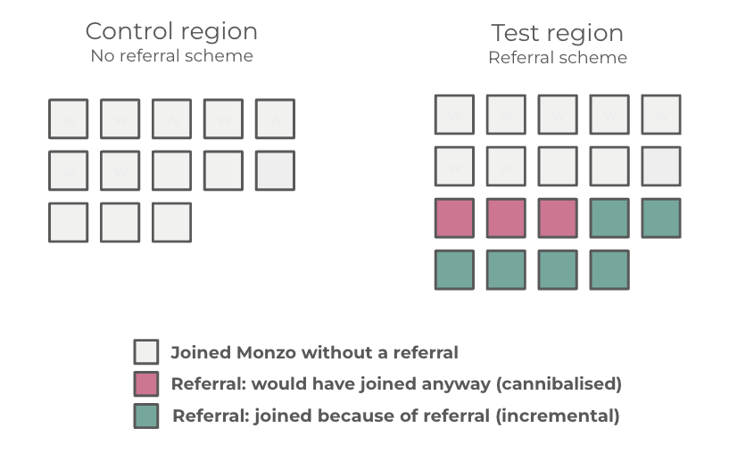
The main reason to use regions is to test whether our referral scheme is causing additional customers to join Monzo (incremental) or whether customers who used a referral would have joined Monzo anyway (cannibalisation). A/B experiments will not work for a referral scheme as our control group doesn’t have a direct measure of word-of-mouth attribution. The following graphic illustrates this from measuring new customers in each region:
Selecting regions for the control and test groups is tricky because we need to find two custom geographies that
have similar demographic and behavioural properties
have low referral bleed (this is when a customer joins Monzo through a referral but they’re outside of the measurable region; these referrals wouldn’t be included in the experiment results, so a high referral bleed would impact the results)
follow a similar trend for new customers joining in order for the incremental uplift to be measurable.
📍 Working with geography data
Working with geographical data presents many challenges, with the biggest being achieving standardisation between data. Datasets such as the ONS Postcode Directory (ONSPD) allocate UK postcodes to a wide range of geographies. For the purposes of building regions, we used a higher-level, aggregated geography as the building blocks for our regions. Using a higher geography allows us to have enough data to explore the spatial distribution of any behavioural or demographic features in our data. These can be visualised in the form of a choropleth, as shown in the following figure for two different features (A and B).
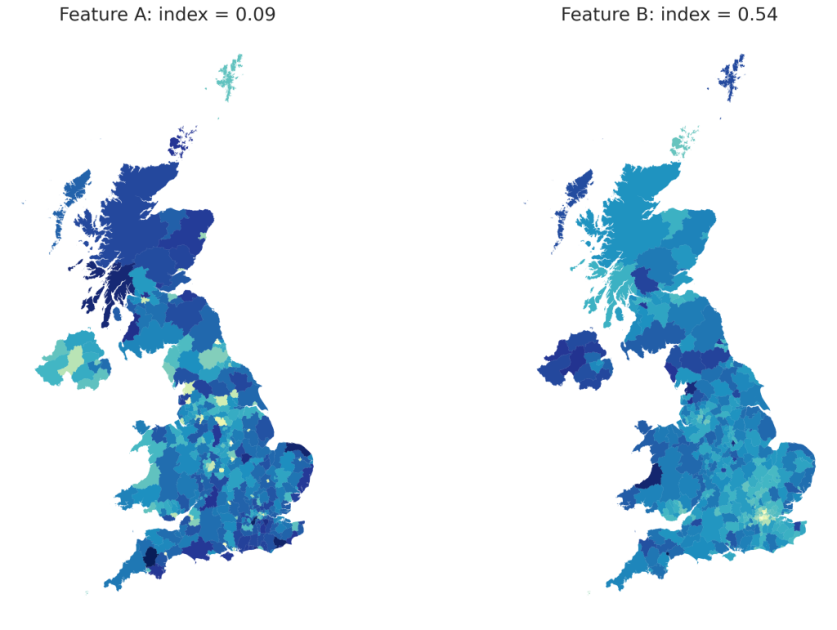
This is useful because it allows us to measure the spatial autocorrelation (how similar closer areas are to other nearby areas) for any of our features. In the figure above, Moran’s Index is the coefficient measuring the spatial autocorrelation. An index of +1 indicates a perfect spatial correlation, -1 means perfect dispersion, and 0 shows that the data are randomly dispersed.
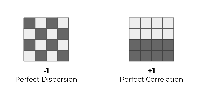
Understanding the spatial distribution and autocorrelation of features in our data makes sure we control for certain underlying characteristics when creating control and test regions.
🏗 Building regions and minimising referral bleed
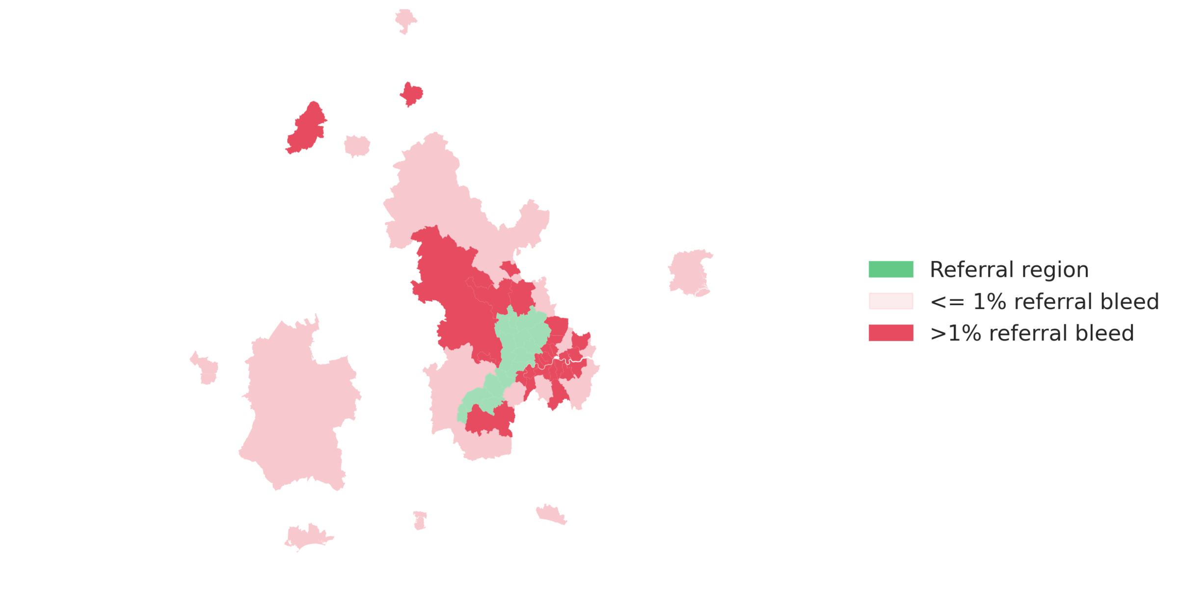
One of the features we sought to minimise while building regions was referral bleed (referrals originating from within a region but attracting a new customer outside the region).
Using historical data, we were able to plot referral bleed against its spatial lag (the average neighbourhood values around a location), which showed a positive relationship. This positive spatial autocorrelation highlights that the skew towards referrals being shared by individuals within close proximity and that if referral bleed from an area is high, the other areas around it will show similar behaviour. Referral bleed from an example region is shown below:
The data on referral bleed and other features identified in our data made up our final dataset. This was then trained on an algorithm called agglomerative hierarchical clustering using spatial weights in order to produce coherent regions.
This approach led to the output of several regions. The final step was choosing control and test regions, which was achieved using historical new customer data to obtain correlation coefficients for which regions follow the same trend.
📐 Measuring incrementality
Correlation is not causation. Causation in our case is measuring the real impact of new customer growth (y) because of our referral scheme (x). In the case of measuring the change in new customers caused by our referral incentive, there will be confounding effects from other variables.
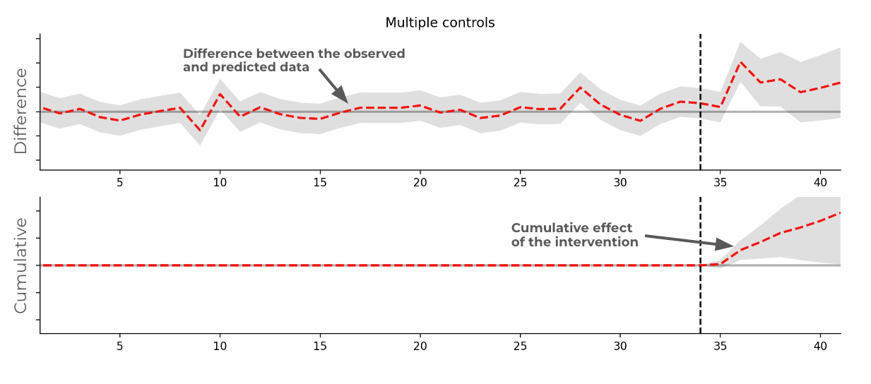
With our test and control regions, we can leverage a method called ‘causal impact’. This is where a control group is used to forecast the trend in the test group had the intervention not happened. Taking this further, we can supply many controls to the causal impact method (‘synthetic control’) so that the model can estimate individual coefficients in multiple time series rather than the sum of the controls.
An example of what a specific intervention could look like in the data is shown in the following chart, demonstrating the difference from an expected trend, and cumulative effect of the intervention. This approach can be used to determine the incremental effect required from our referral scheme to drive significance from the expected new customer trend, rather than being a change caused by random fluctuations in the data.
🤔 Conclusion
The ability to quantify the incremental impact of our referral scheme was important for being able to assess its effectiveness and value. Creating a regional experiment was the most accurate method for Monzo to achieve this by selecting a test and control region. Working with geography data presents challenges, especially when combined with the behaviours of how referrals are shared. The approach covered here is a high-level overview of how we designed this regional experiment.
👩💻 Come and join us
If you love working on these types of data challenges, you should come and join us! We’re hiring for several roles in our data team, including: