New day, new Mondo update! We’ve just pushed a new update to the iOS app (version 1.6) with two big changes and a bunch of Touch ID bug fixes.
Swish, New, Updated Design
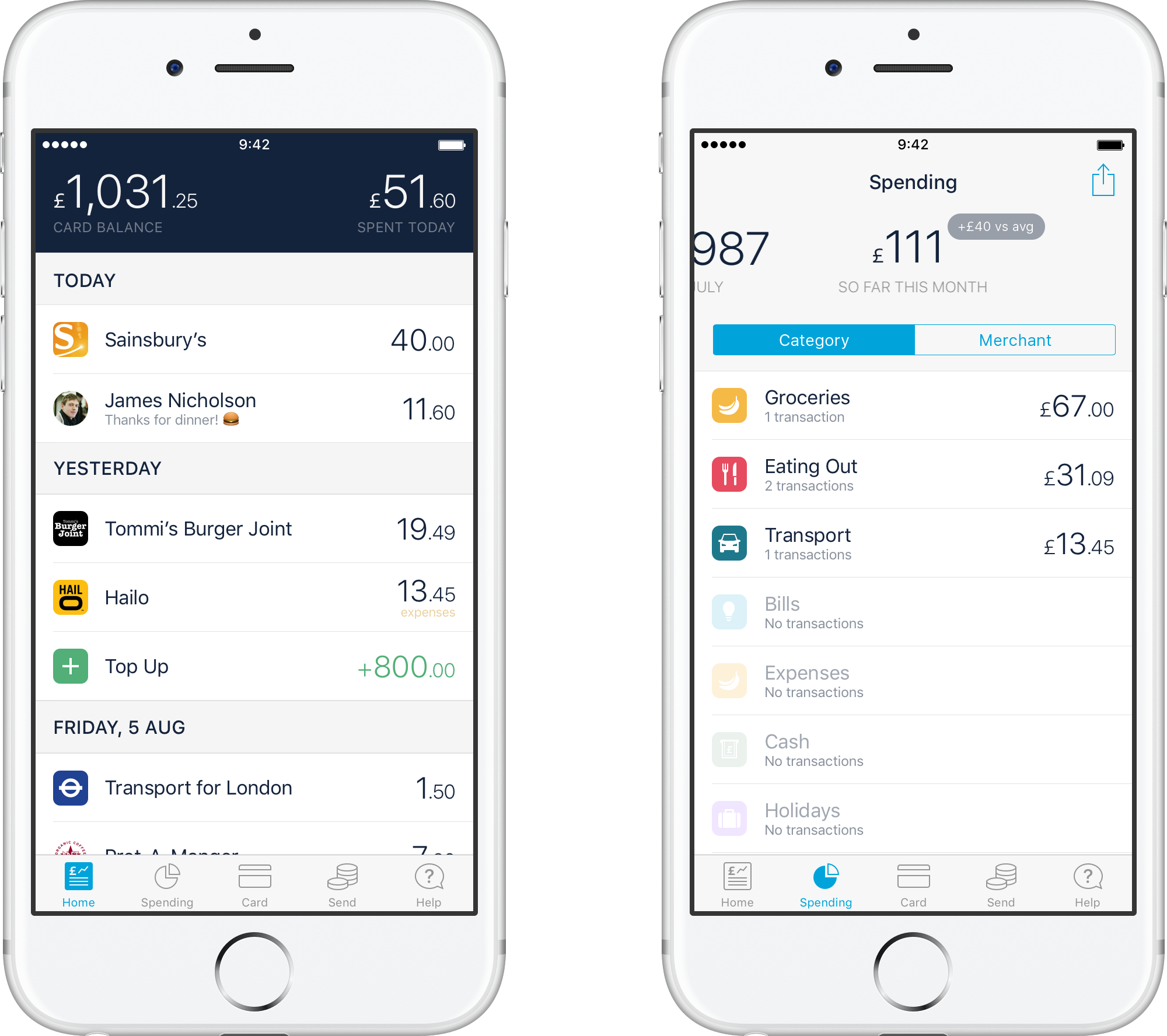
You’ll notice a difference as soon as you open the new app. We’ve expanded the tab bar to five tabs instead of the previous three, tweaked the display of the Balance and Spent Today sections and moved many of the screens from their previous dark themed selves to a lighter, brighter, better look.
A few of our design-orientated early testers asked about the tab bar changes so we thought we’d explain a couple of the reasons behind it:
The previous buttons that took you to your Spending and Card screens weren’t clearly buttons and some users had difficulty in finding the features underneath (like Freeze Your Card and Export).
We want to prepare for future features and make access to them easy and intuitive. Our
upcoming budgeting feature will live in your Spending section and needs to be easily discoverable and likewise, the Card screen will hold features like savings pots at some point (as well as becoming your Account screen when we become a bank). This was a good opportunity to plan ahead and make the changes now.
Smoother, Slicker, Spiffier Balance Graph
We spent a lot of time this release on making your Running Balance graphs better. That involved fixing a variety of bugs, but also making it easier to navigate and scroll more smoothly all the way through your history. This feature really comes into its own if you do a regular, monthly top up as it then predicts how much money you’ll have at the end of the month (or alternatively, when you’ll run out of cash…)
We hope you like it!
We recently updated our name to Monzo! Read more about it here.