
We’ve spent some time over the last few weeks talking about what Mondo stands for and how we represent that visually.
The extraordinary Arthur C. Clarke famously said: “any sufficiently advanced technology is indistinguishable from magic” and we couldn’t put it better ourselves.
Mondo is about creating effortless banking that feels like magic. We know we’ve got it right when the response is “wow, of course banking should be this way”. Whether it’s pausing your card when you mislay it or receiving instant alerts each time you spend money, we're aiming to completely redefine the future of personal finance.
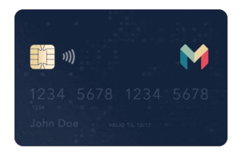
The existing Mondo black and white colour scheme and logo has always been a temporary identity. With the arrival of Marketing and Design to TeamMondo, work began on moving things forward to create a more dynamic and polished identity that matched our newly refined brand positioning.
We sat down for a chat with Sam, our designer, to find out more about the thinking behind the new logo and identity.
Sam, how did you take the idea of “banking that feels like magic” and turn it into the new visual identity?
Magic is intelligent and beautiful and the brand identity is a reflection of these values. At Mondo’s core lie a series of tensions: human/technology, effortless/complex, trustworthy/delightful. I developed the new Mondo mark as an expression of these tensions. It aims to be strong, confident and trustworthy whilst remaining colourful, friendly and human.

Circles form an integral part of this brand identity, can you tell us more about these?
The app is designed around data so I wanted to find a way of expressing this visually in a beautiful way. The dots are data points that flow through the branding; wherever possible they will be brought to life. Mondo distills huge amounts of complex data into meaningful and effortless insights and updates. I wanted to show Mondo at the heart of your life with data flowing around you in a magical way.
What’s next?
I’m starting to look at how we can bring these ideas to the app itself and work with the engineering team to roll the brand out into all aspects of our product. Watch this space...

Update: This post was updated on 28th October to reflect some changes we made to the logo and colour scheme.
We recently updated our name to Monzo! Read more about it here.